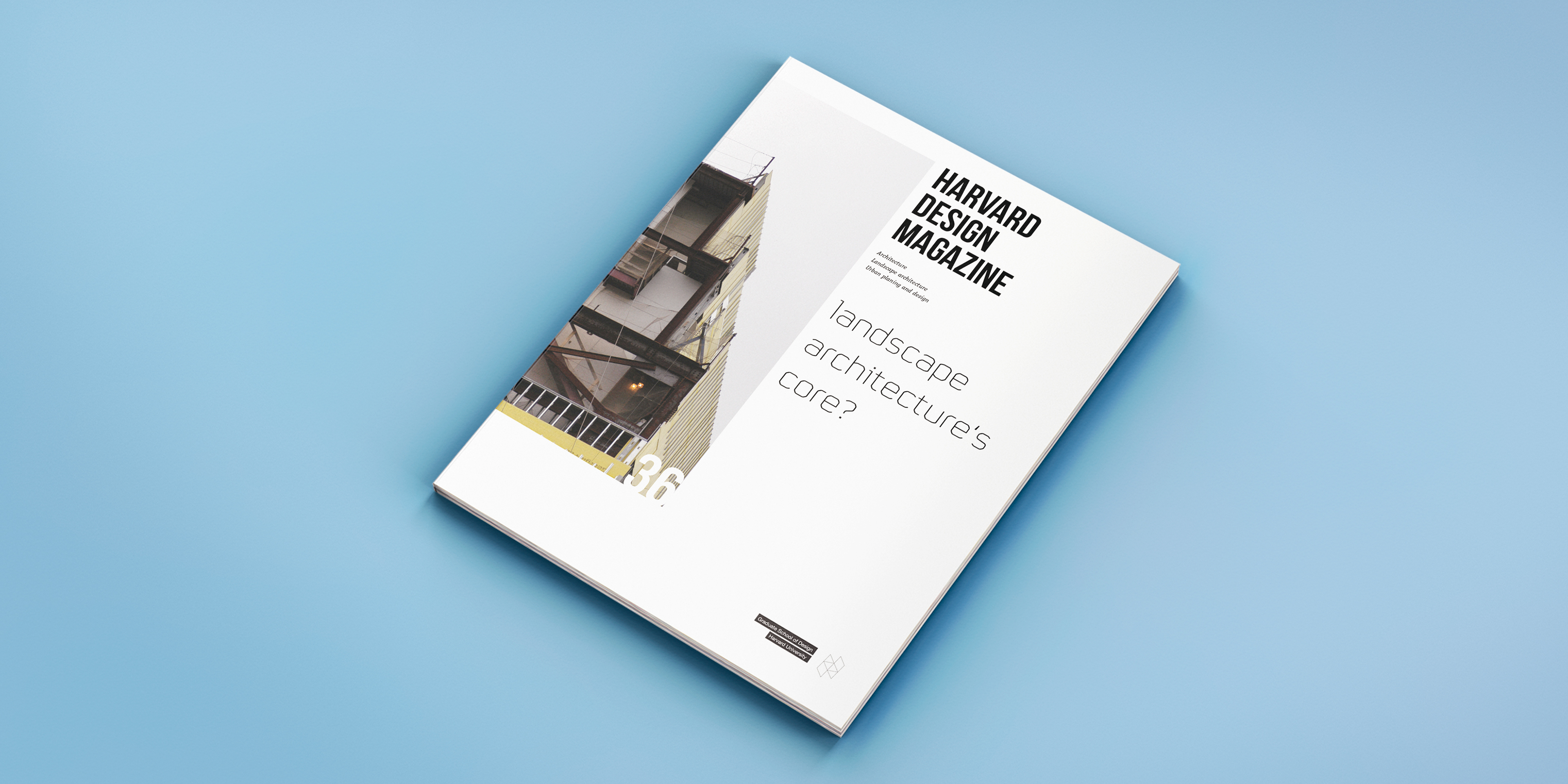
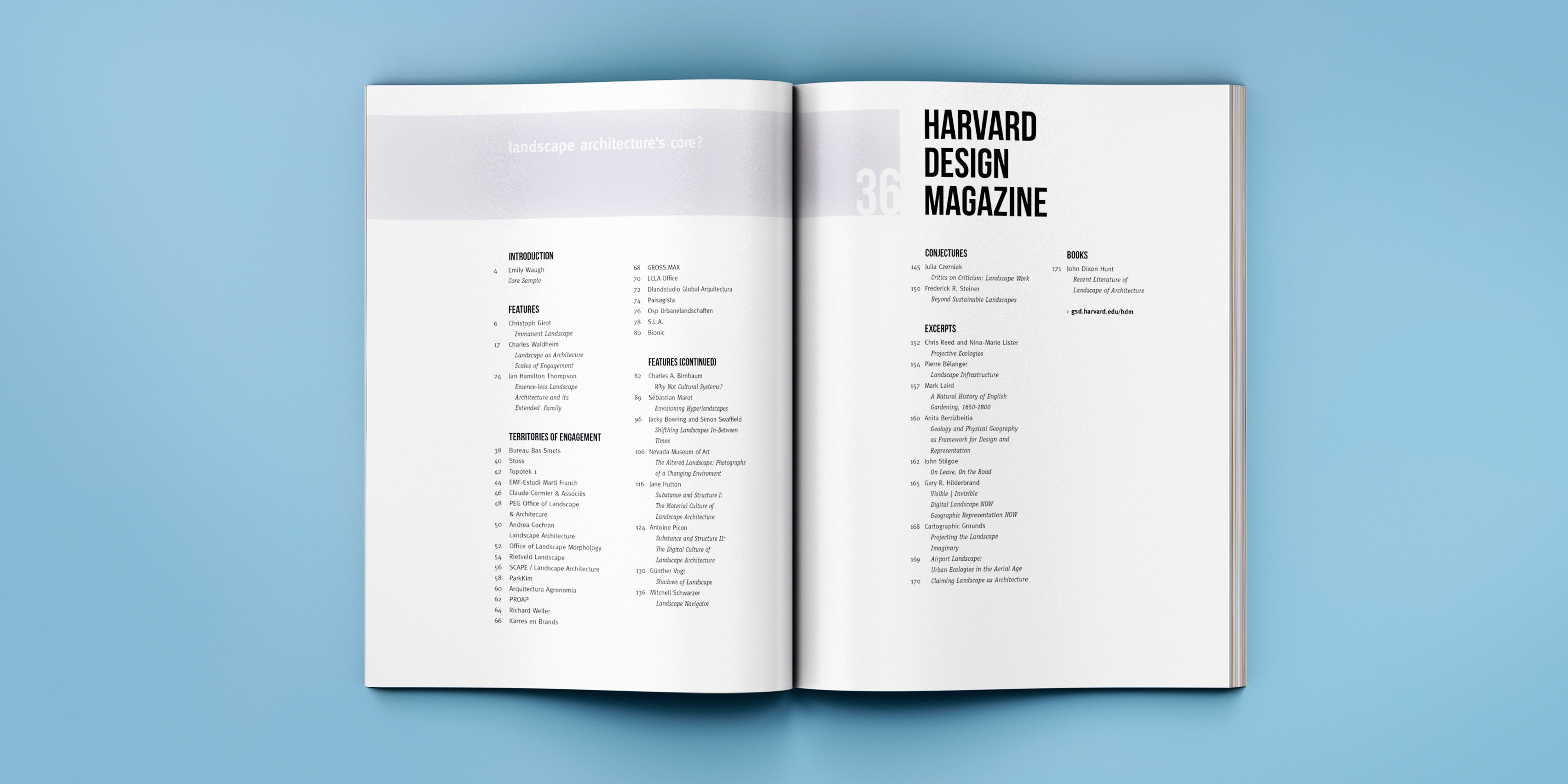
Harvard Design Magazine
For this project we had to redesign a magazine which we were free to choose.
The Harvard Design Magazine already was a nice looking magazine but looking closer I noticed that there were several things that I thought could be better.
I started with changing the fonts used for running text and headlines. I made bigger decisions on the composition of the index of contents and the cover.
The result, as I think, is a much more uniform and proper looking magazine.